|
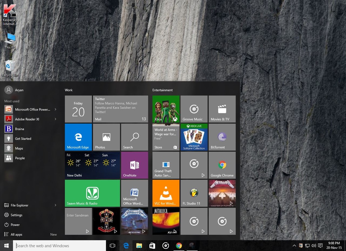
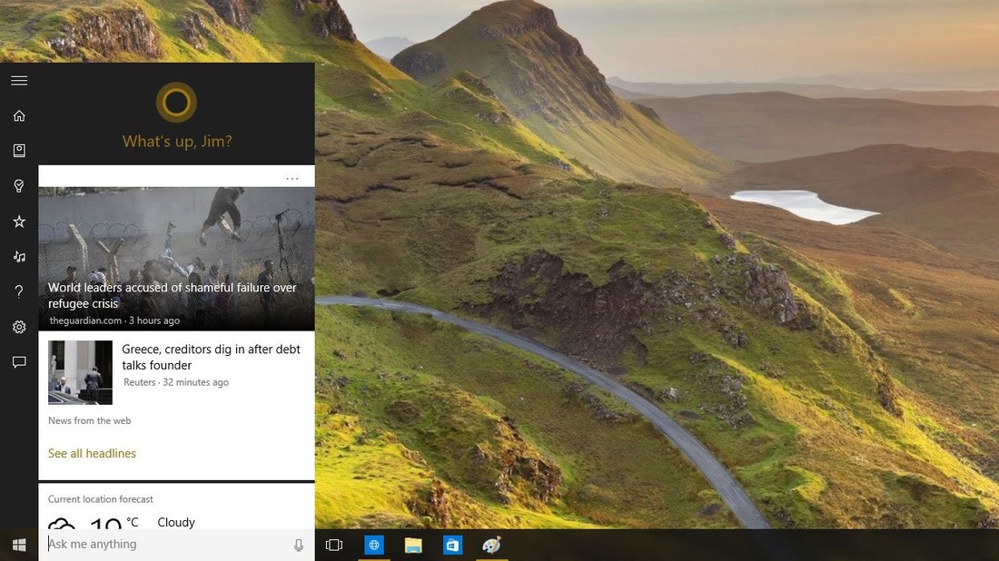
Windows 10 is the Goldilocks version of Microsoft's venerable PC operating system -- a "just right" compromise between the familiar dependability of Windows 7, and the forward-looking touchscreen vision of Windows 8.This new Windows, available as a free upgrade for existing Windows 7 and Windows 8 non-corporate users, is built from the ground up to pursue Microsoft's vision of a unified OS that spans all devices without alienating any one platform. It's an attempt to safeguard Microsoft's crumbling software hegemony, assailed on all sides by Google and Apple. And it's a vision of the future as Microsoft sees it, where a single user experience spans every piece of technology we touch. Welcome to Windows as a service. Yes, this new OS is chock-full of fresh features. To name just a few: a lean, fast Internet Explorer replacement called Edge; Microsoft's Siri-like voice-controlled virtual assistant, Cortana; and the ability to stream real-time games to your desktop from an Xbox One in another room. (And in case you're wondering: there is no "Windows 9" -- Microsoft skipped it, going straight from 8 to 10.) But Windows 10 is also the end of a long, awkward road that began with the release of Windows 8 in 2012, when Microsoft tried to convince a world of keyboard and mouse wielders that touchscreens were the way to go -- or else. Ironically, in 2015, the PC hardware for that touchscreen future is now here -- everything from 2-in-1s such as the Lenovo Yoga line to convertible tablets with detachable keyboards, like Microsoft's own Surface. And Windows 10 smoothly lets users transition from "tablet" to "PC" mode on such devices like never before. For the rest of the PC universe -- including those who still prefer good old-fashioned keyboard and mouse navigation -- Windows 10 is a welcome return to form. The Start menu, inexplicably yanked from 8, is back and working the way you expect it to. Those live tiles from the Windows 8 home screen still exist, but they've been attached to the Start menu, where they make a lot more sense. And the fiendishly hidden Charms bar has been morphed into the more straightforward (and easier to find) Action Center. As always, there are some quibbles and gripes with the end product, but all-in-all -- after living with Windows 10 for months -- I can say it's a winner. It's flexible, adaptable and customizable. And it's been battle-tested by an army of beta testers for the better part of a year, making it one of the most robust operating system rollouts in recent memory. Start Menu As expected, the Start menu is the default if you use Windows 10 with a keyboard and mouse, though you can keep the full-screen Start screen if you prefer it. Even on the Start menu, you can pin Live Tiles in multiple sizes on the right, but on the left you also get the familiar list of pinned and recent applications, complete with jump lists for files, the search box that you can also use to run commands and a power button for shutting down or restarting your PC. The search box has all the Windows 8 features, including results from Bing and the Windows store, and a separate Search menu next to the Start button gives you trending topics directly from Bing, too. You can resize the Start menu, although oddly you can only drag to change the height; changing the width means picking a setting rather than just dragging with the mouse. This is certainly more familiar for mouse and keyboard users, but it remains to be seen whether the Windows 8 users who actually like touch will find it a step backwards. Learning new tricksMicrosoft hasn't stopped at making touch make sense on a Windows PC. With Windows 10, just about every facet of the OS has been tweaked and updated, and a few new features have been rolled in. In typical Microsoft fashion, there's a dizzying array of keyboard shortcuts and touch gestures for each of these features, giving you no fewer than three ways to access the things you're trying to get to. No need to memorize them all -- just use whatever suits you (or your device) best. Virtual desktops If I had to pick my favorite new feature, I'd go with virtual desktops. Click the new Task View button on the taskbar and you'll get a bird's-eye view of all of the apps you've got open. Drag one of those apps onto the "new desktop" button, and it'll be moved to its own independent workspace. I can keep one workspace focused on work, a separate desktop for gaming forums, yet another workspace for the new camera lenses I'm checking out; there's no limit to the amount of virtual desktops you can create, and each one is treated as its own little private island. Virtual desktops are far from a new development, and they've been available in past versions of Windows thanks to third-party apps. But it's nice to see Microsoft catching up here. The feature could still use some work: desktops are numbered, but if you create a lot of them it can be hard to keep track of where everything is. The "traditional" Win32 apps you might download and install from a website are happy to open a new instance on any desktop, while clicking the shortcut on an app from the Windows store will yank you back to whatever desktop you used it on last. You can move apps across virtual desktops -- just drag them, or right-click to shunt them over -- but there's no way to reorder the virtual desktops themselves, which would be really useful for staying organized. I'd also like to be able to set a different wallpaper for every virtual desktop -- I can do both of those things in Apple's OSX operating system, and have always found it really handy. Windows Snap The Snap feature introduced in Windows 7 has gotten a bit of an upgrade, too. Drag an app to the left or right side of the screen, and it'll "snap" to fill that space. The new Snap Assist feature will then chime in, showing you little thumbnails of any other apps that are currently open -- click a thumbnail, and it'll fill up the remaining space. You can also snap an app into a corner of your display and fill your screen with up to four apps, divided equally across the screen -- this could prove useful for folks with massive monitors. Windows 10 will keep evolving. Note that this review is not, and will never be, the review of the final version of Windows 10. Microsoft may have frozen its core operating system in advance of the July 29 launch, but the OS and its apps will be updated continually over their lifespan—which, in the case of Windows 10 itself, will be 10 years. We received multiple assurances, however, that what we reviewed was what existing Windows users received starting July 29 (remember, the rollout will be in phases), and what will be installed on new PCs from a vendor like Lenovo or Dell. And this review also reflects updates that we made after testing against the July 29 "release" code. Let’s emphasize this—there is an incredible amount of activity going on right now. Microsoft is busy fixing bugs, hour by hour. Several issues which we noticed in a draft of this review were resolved by the time the final draft was edited. We expect this will continue. Windows 10 is designed to welcome most Windows users. It will be a free upgrade for users of both Windows 7 and Windows 8/8.1, assuming they switch within a year’s time. Don’t dilly-dally; it’s worth it. Several innovations sell Windows 10 by themselves. The new Start menu blends Windows 7 and Windows 8 for maximum comfort. Cortana, Microsoft’s digital assistant, serves up relevant information. A new set of reminders and updates slide in from the side, then vanish. A few quietly powerful apps, like Photos, show you the potential of Microsoft’s new “Universal” mission. Task View, a somewhat obscure feature that creates virtual desktops, could become a sleeper hit beyond the power users for whom it’s intended. In an ideal world, Windows 10 could have baked a little longer. Quite a bit of the operating system ably demonstrates the care Microsoft took to listen to users and make substantive improvements. The UI designers also seem to have gone out of their way to make Windows 10 less in-your-face than Windows 8 was, though arguably it’s swung a bit too far in the direction of blah. But then there’s the ragged Edge browser. It could use a livelier palette, but its real flaws are functional. Microsoft promised Edge would be our browser for the modern web, and it’s not—at least, not yet. Which Windows 10? Home vs. ProfessionalThe first two questions you should ask yourself are this: Which version of Windows 10 is available for my computer? And which do I need? The first question is relatively easy to answer: if you’re upgrading from Windows 7 Home or the basic version of Windows 8, you’ll receive a free upgrade to Windows 10 Home (officially priced at $119). If you own a Surface Pro or a business PC, chances are you’ll upgrade to Windows 10 Professional ($199). I tested both flavors of Windows 10, using a Microsoft Surface Pro 2 with a version of Windows 10 Professional installed on it, as well as an HP Spectre x360 with the consumer version of Windows 10. WINDOWS 10 REVIEW: SEARCH AND CORTANA Instead of placing a search box in the Start menu, or hiding it completely as is the case in Windows 8, Windows 10 sticks it front and centre on the Taskbar. This is a smart move, as it’s always there ready to serve up whatever you need to find or what to know. The first time you click on the box, you’ll see a prompt to enable Cortana. That’s because Cortana and search are pretty much one and the same in Windows 10. In fact, search is just part of the virtual assistant’s remit. If you’ve ever used a phone running Windows Phone 8, you’ll probably know Cortana already. The beauty is that you can type or talk to her and it’s the same in Windows 10. It’s much faster to tap the microphone button (or even say, “Hey Cortana”) and reel off your request than to type it.
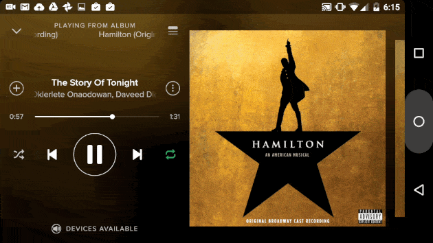
The iPad Mini 4 is the fourth-generation iPad Mini tablet computer designed, developed and marketed by Apple Inc. It was announced along with the iPad Pro on September 9, 2015 and was released the same day. The iPad Mini 4 is also one of the two current iPad Minis sold by Apple, along with the iPad Mini 2; the iPad Mini 4 replaced the iPad Mini 3. Several years ago I was in love with the iPad Mini. It had a 7.9-inch high-res Retina display and it wasn't much larger than a Kindle. It could handle my everyday work and was small enough to sneak along with me wherever I went. It was the perfect travel gadget. It made me wonder why I ever needed a larger iPad at all.Now, of course, I wonder whether I even need an iPad at all, since phones are larger and laptops have gotten more versatile. But the iPad Mini 4 has caught my eye again and I've used it constantly. I like it. But I don't know if it's my favorite iPad anymore. 2014's iPad Mini 3 wasn't really an update; it was, quite literally, just a 2013 iPad Mini 2 with the addition of a Touch ID home button for fingerprint identification. The Mini 4 is the iPad I wanted last year: it has an upgraded A8 processor, better cameras, and a more vivid, color-rich Retina display, and on top of all that it's a bit thinner and lighter. It also supports split-screen apps, the coolest part of iOS 9 -- the Mini 4 joins the iPad Air 2 and the upcoming iPad Pro as the only iPads that can do it. Software The iPad Mini 4 ships with the iOS 9 operating system pre-installed, and was the first device to do so. Due to an additional 1 GB of RAM compared to the previous generation's Mini, the iPad Mini 4 is capable of utilizing the Slide Over, Split View and Picture in Picture multitasking functions. The device is compatible with iOS 9.1, which was released on October 21, 2015, which adds the News app for the UK and Australia as well as additional emoji and other bug fixes. Design The iPad Mini 4 was the first major redesign of the iPad Mini line, with a slightly taller and wider body (although there is no increase in screen size). There is also a much thinner design, with the device mirroring the depth being the same as the iPad Air 2 at 6.1 mm. This device is also lighter than the previous generation by 33.2 g. Due to this redesign, the device is incompatible with cases that would otherwise work with the iPad Mini 2 or the now discontinued iPad Mini 3. Apple released a Smart Cover and Silicone Case for the Mini 4, which can be used separately or in conjunction to make a full protective case. Unlike the iPad Air 2, there is no leather Smart Case for the device. The iPad Mini 4 is available in three colors: Space Grey, Silver and Gold. Convenience So, let's assume you have a 5-inch or larger phone. The extra space of a 7.9-inch tablet is nothing to sneeze at; it adds up to significantly more screen real estate than you'd expect, and its 4:3 aspect ratio fits word processing and productivity apps better than 16:9. But the days of clear divisions between gadget screens are over. It's a gentle curve from tiny all the way up to super-big, and you pick the size that works best for you. The Mini still feels like a superior e-reading device: it's Kindle-like and easy to tuck away in a small bag. I've taken notes on mine, too, in landscape mode. But you can do a lot of movie-watching and game-playing on larger-screened phones now, too. Camera The front-facing 1.2-megapixel FaceTime camera is the same one found on all current iPads (except for the addition of burst mode), but the rear iSight camera gets ramped up from 5 to 8 megapixels to match the one on the iPad Air 2. I wouldn't want to shoot a feature film with it, but it's good for the sort of home movies that are the more common target of tablet video shoots. More importantly, it's a very solid tablet for making FaceTime and Skype video calls. Display Compared to previous recent iPad Mini models, the screen is enhanced. It has the same 2,048x1,536 "Retina" resolution as the iPad Mini 2 and 3, and adds the same laminated display and antireflective coating as the iPad Air 2 and iPad Pro. The difference was noticeable, giving the screen a real pop -- colors seem richer and more vivid, too, matching the quality of the Air 2. Overall Verdict iPad sales continue to decline. That's the world in which the iPad Mini 4 is competing. People just don't need new iPads every year. If you have anything newer than a first-gen iPad or iPad Mini, odds are they still work well -- and they can be upgraded to iOS 9. And the things iPads do can often be done elsewhere, by your phone or laptop. Apple didn't make a big deal out of the iPad Mini 4 when it was first announced, and it's easy to see why. The new iPhone 6S and 6S Plus sport A9 chips, and pressure-sensitive 3D Touch screens. The iPad Pro has a giant screen, a big step-up A9X chip and additional accessories. The iPad Mini 4 isn't as good as those gadgets. It's a simpler type of device. But it is a welcome, overdue upgrade to the Mini line. My biggest concern about this iPad is that it may not seem so powerful this time next year. It doesn't have Apple's latest iOS hardware advantages, except for iOS 9 multitasking. I'd say this is the perfect kid iPad, but it isn't. The same less expensive-yet-totally-still-capable iPad Mini 2 that I mentioned earlier is a better wallet-friendly bet. And that's only if you want to stick with Apple's iOS operating system. I think that's smart for anyone who already has an iPhone, but the fact is most of the same apps and basic features are available on Android and Amazon Fire tablets. Indeed, Amazon's 7-inch kid tablet costs $100 and comes with a no-questions-asked 2-year replacement guarantee. But if I'm sticking with iOS, I'd rather give my kid an iPad Mini than an iPod Touch. The Mini has aspirations of being not just a full e-reader, but a mini computer, too. It can go places and do things. For its size, it's the most versatile jack-of-all-trades iOS device in Apple's lineup. It's not an iPhone or a super-iPad. And I don't need it as much as I used to. But damn it, I still love its size.  It Oneplus announced it's new smartphone on October 29th. It's the Oneplus X. This phone is mainly targeted for the design conscious audience. This doesn't means that this phone is not powerful in the specs department. It has the same processor as the earlier Oneplus One, the Snapdragon 801 and 3GB RAM. The difference here is the the in hand feel and the build quality. This phone has front and back glass panels protected by the Gorilla Glass 3 and it features a metal chassis around the sides. It has a 5 inch 1080p AMOLED screen which gives it a pixel density of 441 ppi which is pretty impressive. It is a dual sim phone with a hybrid sim card tray which basically means that it can house 2 nano sim cards or 1 nano sim card and a micro SD card upto 128GB and it will always be a nice thing for phones to have expandable storage capability. On the internal front it has 16GB of internal storage, Snapdragon 801 chipset clocked at 2.3Ghz which is lower than the clock speed of Oneplus One's chipset and has Adreno 330 GPU. It is priced in India for 16,999 INR for the Onyx version and 22,999 INR for the Ceramic version and is exclusively available on Amazon India. This time around Oneplus will host the Invite System sales for a month and then weekly open sales will be conducted. The difference between the Onyx and Ceramic is the the back panel. It has a 13MP rear camera and a 8MP front shooter. Both the cameras perform very well in all the lighting conditions. It has a 2525mAh battery which can last for a full working day on moderate usage. It is only available in black and white color. It runs on Oxygen OS 2.0.1 which runs on top of Android 5.1.1 Lollipop. It also has a alert slider which will always be a welcome addition but this time this phone lacks a fingerprint sensor. Do check out the camera samples for this phone that i have posted!!  With IOS 9 and Windows 10 coming Android 6.0 Marshmallow has also been released by Google. I know that not everyone even has Android Lollipop yet, so I won't just concentrate on the differences between the two most recent versions of Android. Instead I'll look at the major areas of the new OS, whether they are new, improved or missing in action. I'll break the review down into: the visual appearance of Android Marshmallow; integration of new Google products; core features of the system; security; and improvements to usability. Take a look around. Do it quickly enough and you might not notice anything different from the big Android update we got last year. Material Design was a huge, highly valuable step forward for Android; this year's update polishes down some of the look's rougher edges and makes a few things more prominent. Consider the lock screen's font, for one -- the time is a bit bolder than it was before, better for those discreet time checks. Then there's the launcher, which some people have been getting a taste of without even updating to Marshmallow. The white background will seem awfully familiar, but that's it as far as similarities go. Remember the multiple pages of apps you had to swipe left and right through in Lollipop? They're all gone, replaced by a single, vertically scrolling tray of icons capped off with four of your most used programs sitting atop the tray. Above that sits a handy search bar, which also (thankfully, finally) lives in the Settings menu so you don't have to poke around aimlessly looking for an arcane option to change. I sort of preferred the paginated app view from days past, but the addition of a search feature is insanely helpful -- where was this before? Marshmallow's actually slightly more customizable than previous versions if you know where to look. The System UI tuner we first spotted in the Android M preview is hidden by default; to access, you have to swipe down into your Quick Settings panel and press on the gear icon until it starts spinning. The same can't be said about my favorite of Marshmallow's minor UI enhancements: the much-improved copy-and-paste commands. It used to be that pressing and selecting text to share required you to decipher some arcane symbols at the top of the screen, but that's been replaced by a simple pop-up menu with -- wait for it -- the words select all, copy, paste and web search. That latter option is on a separate "page" from the others; while that's mildly annoying, it's still worth actually having command buttons that make sense at a glance. Once the sharing mood sets in, you might also notice what Google calls Direct Share. When you try to share content from certain apps, you'll get the option to send it directly to contacts instead of just opening that stuff in another app. Incredibly handy? You bet, but sadly, very few apps support it right now. Now on Tap Now on Tap, on the other hand, is Google at its most Google-y. Long-pressing the home button causes a white line to trace its way around the screen -- once that's done, Google tries to figure out what you're looking at and gives you related information about it. After using it for a while, Now on Tap feels like one of those little touches that should've always been there. Let's say you're listening to something in Spotify, since Now on Tap plays nice with apps beyond ones Google has crafted. I've used the Hamilton example before, but let's dive back into it. Listening to the track "My Shot" (which you should definitely do) and invoking Now on Tap brings up four results cards: three for the principal singers in the song, plus one for the title of the song itself. It's also, sadly, far from perfect. Spotify songs are easy to figure out -- all that's on-screen to interpret is the name of the song, the artist and the album title. Launching Now on Tap on a web page, for instance, can be far less rewarding as Google doesn't always provide a results card for the things you want to see. Now in fairness, it's early days for this feature and it's pretty great in its current shape. Still, given how much of my own information I've willingly offered to Google -- all my emails, all the birthdays and meetings in my calendars, the entirety of my search history -- you'd think it would be able to get a better sense of what it is I'm actually trying to learn more about. Then again, that logic cuts both ways. For all that Google knows about us, it's (thankfully) not a mind reader and can't anticipate my desires on the fly. That Now on Tap will get better is a given; the question you'll have to consider is whether you want to give even more insight into what you do on the web. A better approach to permissions As damned helpful as Now on Tap can be, chances are you're going to experience Marshmallow's revamped approach to app permissions far more frequently. Let's flashback to last year: Before even downloading an app, users had to agree to a load of potential actions that software could perform at some point. With Marshmallow, Google very smartly decided not to front-load all that information and instead alerts you whenever an app you've installed tries to do something new for the first time, like when Twitter wants to figure out where you are or when Chrome wants access to your media. If an app mentions wanting to do something that makes the hair on the back of your neck stand up, feel free to deny it the access it wants -- in most cases, the rest of the program should still work. Oh, and if you're the kind of person who just taps "Accept" all the time anyway? Popping into the Settings reveals which apps have access to which parts of your device, from the camera to contacts to location, storage and even body sensors. Revoking access is just a tap away, so don't be afraid to make some executive decisions. Yes, you'll be dealing with these notifications pretty frequently, and yes, the whole thing feels a little more intrusive than before. Still, it forces users to understand what their apps are doing and when -- making everyone more security-conscious is worth some tiny inconveniences. Fingerprints for all Speaking of security, Marshmallow is very much into the idea of using your fingerprints as authentication. Need proof? Just look at the two new Nexus handsets. Setup is dead-simple and familiar -- you'll be lifting and pressing down onto the sensor multiple times until you're given the OK. Interestingly, Google doesn't assume that you want to use your fingerprints for everything once you've got at least one on file. Buying apps from the Play Store defaults to using your password for authentication, for instance -- you have to tick a box before you can sign off on purchases with a finger. Once that's done, though, you're all good, and thankfully both of the devices I've been testing Marshmallow with (the Nexus 6P and the HTC One A9) have excellent sensors that quickly and accurately pick up finger touches. That's really no surprise, though: Google's very picky about how good these sensors should be. Now we just need more developers to get on the fingerprint bandwagon. Under the hood Beyond some of those marquee features, Marshmallow also packs a few tricks to keep your device running for as long as possible. Doze is the more technically impressive of the batch since it determines when your device is just sitting around and shuts down nearly all background services and disables your network connection. If a priority message rolls in via Google Cloud Messaging, Marshmallow dutifully surfaces it, but otherwise you've basically got a device that automatically switches into airplane mode when you don't need it. The results are obvious, and impressive. As I write this, a near-dead Nexus 6P has been clinging to life with 2 percent battery for nearly an hour. Then there's App Standby, which automatically flips programs into an inactive state if they haven't been used in a while to further save your battery. If you've ever had to disable some carrier bloatware apps because they were just never used, well, that's basically the same idea here. The only difference is App Standby works automatically. Marshmallow disables apps that haven't been launched lately, aren't running a process or aren't generating notifications. The only potential downside here is that Marshmallow could always deactivate an app you actually wanted to keep, but there are two quick fixes: Open it once in a while, or jump into the Settings to manually restore it (you can even flag it so that it never gets deactivated again). Like it or not, the trusty microSD card slots of yore are disappearing from modern smartphones. If you're lucky enough to have such a slot handy (and haven't completely given yourself over to the cloud), Marshmallow allows you to format the card as internal storage so you can move apps and data that otherwise couldn't have been routed to an external card. Word to the wise: If you do this, don't panic at what you see. Marshmallow combines the storage counts into a single total (a feature called Flex Storage), but still offers a readout of how much room is available on both the internal and external memory. Your phone will also warn you when the SD card you're using is too slow to do much good --you'll want the fastest microSD you can get your hands on, and even a 16GB microSD card with transfer speeds up to 48MB/s prompted a stern warning. The best-case scenario is that you won't notice a difference between the two forms of storage when you start installing apps and moving data, but that's going to hinge largely on the kind of card you're working with. And if all of this sounds like too much effort, you could always just pop in a microSD card and treat it as portable storage -- that way, you can move files between devices without a headache. The coming of Marshmallow also means we've finally got a robust way to backup app data without the need for physical cards. It's called -- what else -- Auto Backup, which occasionally shuttles most of a user's app data into a dedicated corner of Google Drive that can easily be drawn upon again if you're reinstalling an app you've deleted. Oh, and in case you were worried, none of the space taken up by those backups count against your existing Google Drive quota. Overall Verdict Marshmallow might not be the sort of dramatic leap forward we'd expect from Android 6.0, but let's not dwell on the number. What we've got here is an update that takes most of what was great about Lollipop, axed what didn't work (here's looking at you, convoluted volume controls) and added features we didn't even know we wanted. Sure, not everything has been executed perfectly, but the net value of features like Now on Tap, improved permissions, Flex Storage and others more than make up for occasional bits of flakiness. Android has never felt more complete -- now (if you'll pardon the pun) it's on manufacturers to make sure everyone gets a taste soon.
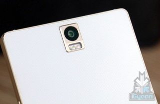
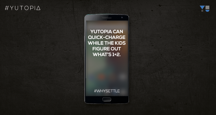
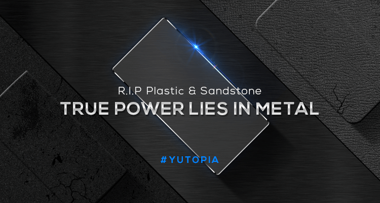
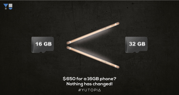
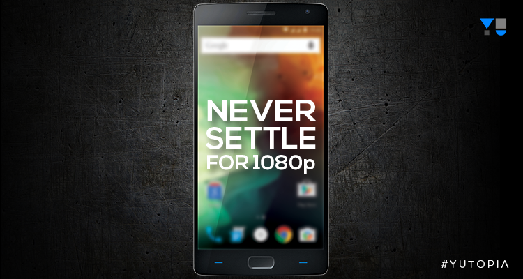
 YU Yutopia Confirmed Specs and Leaks!- Does it really look like the most powerful phone till yet?11/11/2015 YU has finally begin the registrations for it's flagship device- YU Yutopia. YU claims that it would be the most powerful phone on Earth till date. It will be unleashed on 17th December 2015. As all other YU devices, this phone will be exclusive in India. Specs of this mighty device has benn leaked by the third-party apps like Antutu Benchmarks and GeekBench Benchmarks. Leaks say that this phone will boast a Qualcomm Snapdragon 810 (MSM8994) chipset. It will have 4GB RAM that is incredible in terms of multitasking. The company itself has confirmed some of the specs that it will have a Quad HD Display, a 64GB variant that will be available for much less than the iPhone 6S that is priced at $699. The company has been targeting Oneplus and Apple by their campaigns. Campaign about Oneplus 2 said "Never Settle for 1080p Display" which has confirmed that this phone will feature a Quad HD Display. Another campaign said " 3 hours will be wasted with the Oneplus 2. While kids figure out what is 1+2, Yutopia can quick charge the battery". This has thus confirmed that Yutopia will support Qualcomm Quickcharge. According to me it would be Quickcharge 2.0 relative to the most powerful phone promise for more likely campaign. The campaign against the Apple iPhone 6S and 6S Plus said "Is it fair to pay $699 for a 16GB and 32GB phone" Leaks suggest that the phone would be carved out of metal. A picture of the phone is also leaked by iGyaan. This picture confirms that it will sport a dual tone CCT flash. This picture has also leaked some parts of the design of this phone. It is now confirmed that this phone will be available in Champagne Gold colour and as well as other colours. This phone will run on Cyanogen OS 12.1 i.e based on Android Lollipop 5.1.1. YU has created a lot of buzz in the market by Yutopia and lets hope that it will be the most powerful phone. Update: I have reviewed this device here and I have compared it with OnePlus 2 as well here!
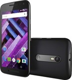
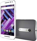
    Apple claims that the only thing changed between iPhone 6 and 6S is everything. Is it really so, let's find out! This phone is a beast in almost everything though it seems to be very less powerful as compared to the other flagships like the Samsung Galaxy Note 5 and Galaxy S6. It features a 4.7 inch Full HD screen with a pixel density of 326ppi. It runs on IOS 9 which had some bugs and lags but now they have been fixed by the IOS 9.0.2 update. This phone has 2GB RAM which seems to be small but the actual RAM management is great. It competes with the Galaxy Note 5 in this department. It has the Apple's all new A9 dual core chipset which is very powerful with PowerVR GT7600 (six-core graphics) GPU. The CPU is clocked a 1.83 Ghz. The design of the phone is identical to the iPhone 6 but this time it is also available in one more color option Rose Gold. It is a very snappy phone. This time around this iPhone will also support 4K video recording due to a 12MP rear camera sensor. This phone also boasts a 5MP front-camera. Apple has also introduced 3D Touch or Force Touch in this iPhone which means that this phone's display is now pressure sensitive. Apps on the home screen, some of the third-party apps and all the Apple apps support this feature but some third party apps still have work on providing this feature for their application. This feature is not a marketing gimmick according to me but it's just that this will take time to affect it in all the third party apps. One more feature bundled with this phone is the Live Photos feature. This feature lets you capture a short moment through the rear camera and then it can be set as wallpaper. When we will force touch our finger on the home screen, then the whole clip would be played in the background. This feature is a good add on if you have enough storage to spend on it. This feature according to me is a lot similar to the normal video but for me it's a welcome feature. 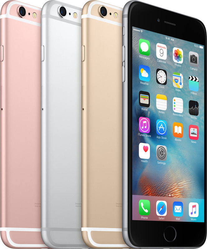 Moto X Play is a good device and it is basically a stripped down version of the Moto X Style. It is priced at 18,499 INR for the basic 16 GB model and 19,999 INR for the 32 GB model. It also comes in 2 colours- White and Black. Both look very nice but a lot of people have noticed that the black back plate is more durable than the white one as the white one gets scratched and peeled of easily. So the phone has 2GB RAM, Snapdragon 615 processor which is a octa-core processor. It has a 5.5 inch Full HD display with a pixel density of 403 ppi. Its has a very nice 21MP rear camera and a 5MP front facing camera for crispier selfies. The camera is much better than I expected it to be. It supports USB OTG as well. It has a water resistance nano coating but not like the new Moto G that is IPX7 rated. It is a device made for the people who are not much into gaming. The Moto X Play is the balancing act between the Moto G and Moto X Style with a tendency to aim high instead of settle for less. At 5.5 inches in diagonal its display still puts it in phablet territory, leaving the Moto G (3rd gen) to cater to compact phone lovers. It's a Full HD panel too, striking the obvious reasonable compromise between sharpness and battery life. And battery life is one area, where the Moto X Play should excel - it has a huge 3,630mAh cell, with support for fast charging too, though a Turbo Charger has sadly been omitted from the bundle. One of the coolest features of the Moto X Play is customizability. You can choose from close to 200 color combinations between the front panel, back cover, frame and camera accent, and sport the look that best fits your style. That is, if you're in one of the few lucky countries where the Motomaker is available. But for Indian buyers this one isn't a pro as Moto Maker is not available in India currently. The Moto X Play and its premium-tier sibling, the Moto X Style, both have a 21-megapixel camera that Motorola guarantees will make its phones "best in class.” Motorola can rectify its biggest weakness while retaining the things that make its hardware attractive, it would indeed deserve to be part of that conversation.The Moto X Play appears to have all the things that a modern smartphone requires and none of the superfluous extras. The Android software on board is barely distinguishable from Google’s stock version. Its processor, memory, and display specs are all a step down from the X Style, but the X Play actually has a larger battery and promises to last for two days on a single charge. And then there’s the price, which at £250 (roughly $385) in the UK is exactly half the cost of a new Galaxy S6. Even if you use the Moto Maker customization service and bump your expenditure up to £279, you’ll still be paying roughly half the price of an iPhone 6 or an HTC One M9. 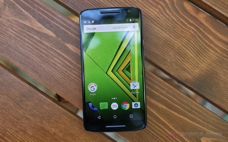 It is an awesome phone! It is priced at 29,999 INR for the 16GB version and 31,999 INR for the 32GB version. It comes in 2 colours- Black and White. It runs on the nearly stock version on Android Lollipop 5.1.1 and Motorola has claimed that it will be getting an Android M update soon. It has a 5.7 inch screen with a resolution of 1440 x 2560 pixels and is able to get 520 ppi out of it's brilliant display. It is a IPS LCD screen. It has 3GB RAM and has Snapdragon 808 chipset under the hood which is very battery efficient and it's performance is also not far behind from the Snapdragon 810 chipset. It has a 3000mAh non removable battery though the battery life is not that impressive thanks to the brilliantly pixel packed display. It has a 21MP rear camera with a dual tone CCT flash and has a 5MP front facing camera with a front facing flash. The pictures come out to be nice in all the conditions but it excels in the outdoor lighting conditions. It also has the front facing stereo speakers that are top notch as it has crystal clear sound and a very loud speaker as well. Other features include Moto Actions app which has the features like the moto display that lets you save some battery and voice gestures and much more. It is a very powerful device and has Gorilla Glass 3 protection on the screen. It’s a bit like company selling plastic and metal forks and insisting on calling the latter ‘catwalk cutlery’. Nah mate, it’s just metal. Maybe this point has stuck with me because I’m using the white version of the Moto X Style. I’ve nothing against white phones per se, but the white Style doesn’t half show off that the front of the handset is absolutely peppered with tiny little sensors. It looks like the phone equivalent of a swiss army knife. Pro tip: consider the black version carefully. It looks better. So rather than using under-the-hood slots for the SIM and microSD slots, the cards fit into a tray that pops out from the phone’s top. There’s no flexing to this phone and while the back is plastic, it’s nicely soft to the touch. The metal surround does add a touch of class too, and as with all current Moto phones, the curvy design helps disguise that at its thickest point the Style is a chunky 11.1mm thick. The body is nano-coated, giving it IP52 protection as well. That means it’s impervious to dust, and can withstand water sprays but not being submerged. In other words, heavy rain is fine, just don’t drop the Moto X Style down the toilet. Other than being mis-sold as a ‘Style’ phone, the only other thing to hold you back on this Moto’s design front is its size. The Motorola Moto X Style feels quite a lot like a slightly-shrunk Nexus 6, because that’s basically what it is. 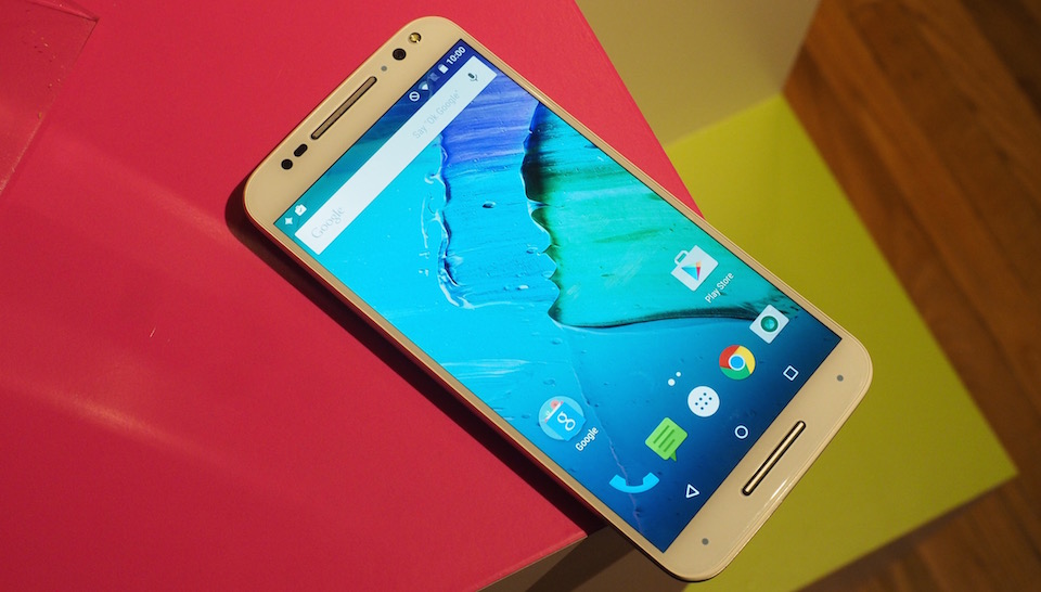 Recently, Motorola announced it's new phone Moto G Turbo that has an upgraded Qualcomm Snapdragon 615 chipset and a Full HD display instead of the older 720p display. These are the only major differences between the Moto G3 and Moto G Turbo. Unlike the Moto G3, it is only available in 16GB ROM and 2GB RAM variant. All the other aspects such as design, camera, screen quality and the water proof IPX7 rating is the same. I will not be posting any separate Gallery and Camera Samples as the camera present is exactly the same. Currently this phone is only available in Mexico and as of now Motorola seems to have no plans for releasing this phone in other markets like India, United States and China. Also a point worth mentioning is it's price tag. It is priced a little more than the Moto G3. The difference is of about $35. Stay tuned for more content for the Moto G Turbo! Update- It has launched in India for Rs. 14,499. You can buy it exclusively from Flipkart- Black and White
The smartphone industry has a specifications problem and the tech press must share a large part of the blame. We are living in a world that's obsessed with octa-core processors, 13-megapixel cameras, and gigabytes of RAM, but we don't spend enough time talking about the thing that really matters - how it feels to use a phone on an everyday basis. It is a great phone and it is an all rounder amongst the budget oriented devices. It is priced at 11,999 INR for the 8GB version and 12,999 INR for the 16GB version. I would suggest you to go with the higher 16GB version as it has 2GB RAM too. It has expandable storage option and it is also water proof for up to 30 minutes in the fresh water up to 3 feet because of the IPX7 water resistance rating. Also, it will be receiving the Android M update soon and it is confirmed by Motorola. Also it is available in 2 colours- Black and White. It has a good build quality and it has a 13MP rear camera and a 5MP front facing camera. Both the cameras are quite impressive in the natural lighting conditions but the Moto G camera struggles to focus in low light conditions.it is a nice device with 5 inch display, Snapdragon 410 chipset which is a quad core processor, 1/2GB RAM, 8/16GB internal storage and a curved back because of which the in hand feel of the Moto G is very nice. It has a IPS LCD display panel and it is protected by the Gorilla Glass 3. And it runs on almost stock android version of the 5.1.1 Lollipop out of the box. It runs buttery smooth and I didn't noticed any kind of lags most of the time. It seems to be low speced than it's competitors but in real life scenarios, it holds up pretty well in the performance department. It has a dual tone CCT flash on the back and it has a single front facing speaker which is awesome and is very loud and clear. The Moto G 3rd gen has a design that's quintessential Motorola, but it still has a unique touch. While the smartphone doesn't exactly stand out from the crowd in terms of looks, the in-hand feel is really good and wouldn't be out of place on a more expensive device. The textured back strikes the right balance between design and functionality - it looks good and provides enough friction to offer a secure grip, without being rough like the finishes we've seen on some other smartphones. The Moto G's removable rear panel is also a boon rather than a curse. These come in a variety of different colours and can be swapped in and out as you please, making it much more personal and customisable than any other handset at this price. The Camera app that ships with the Moto G 3rd gen is in autofocus mode by default, which means you take pictures by tapping the screen. You can go to the app's settings and switch on the focus and exposure controls, and a reticule comes up on screen that you can slide around to focus on particular objects. There's also a dial that you can use to adjust exposure settings. This is a welcome addition, but it's not as intuitive as the usual tap-to-focus convention (admittedly you can use a third-party app if that's what you prefer). The app also has an HDR mode, though you can't use it in combination with the focus and exposure controls. In terms of image quality, the Moto G 3rd gen captures good detail outdoors and in well-lit conditions. However, the low-light performance could have been better. The front camera is more than adequate to keep the selfie-obsessed happy. 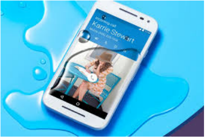 |